Knowledge base
1000 FAQs, 500 tutorials and instructional videos. Here, there are only solutions!
Create a responsive website with Site Creator
This guide details how Site Creator from Infomaniak and the website created with it behave with different screen formats and resolutions.
Prerequisites
- Access Site Creator:
- Click here to access the management of your product on the Infomaniak Manager (need help?).
- Click directly on the name assigned to the Site Creator in question.
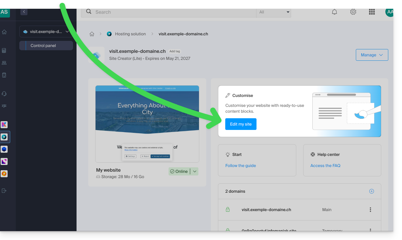
- Click on the Edit my site button to launch the editor:
View the site on different devices
Websites created with Site Creator are automatically adapted to browsers regardless of the device (computer, mobile device, tablet, large and small screen, etc.). However, they may behave differently depending on certain settings that you can adjust.
To preview the website version based on the display device:
- Click on the ••• button at the very bottom of the left-hand menu to expand the publishing and preview options:
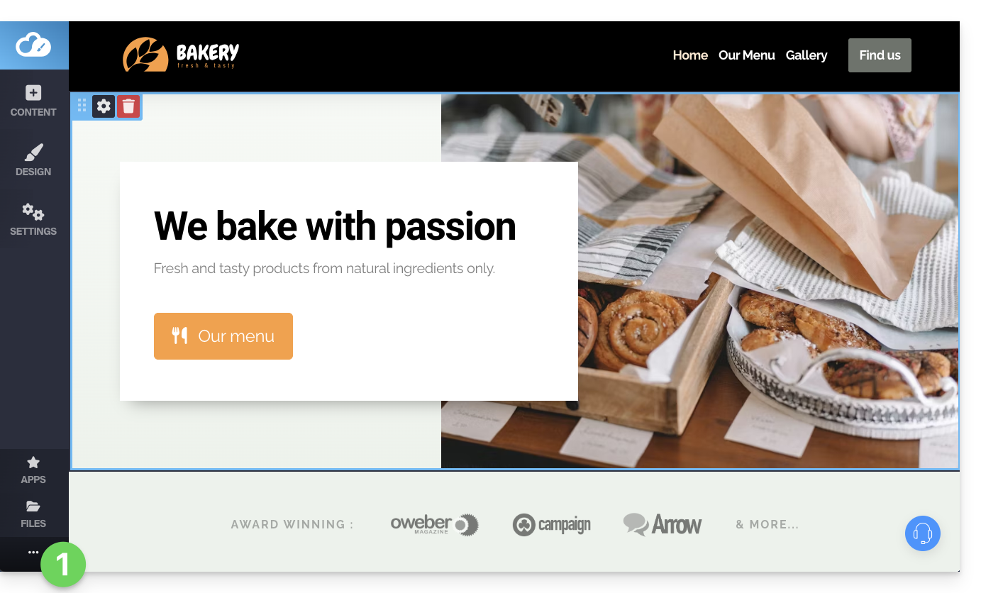
- Click on Preview:
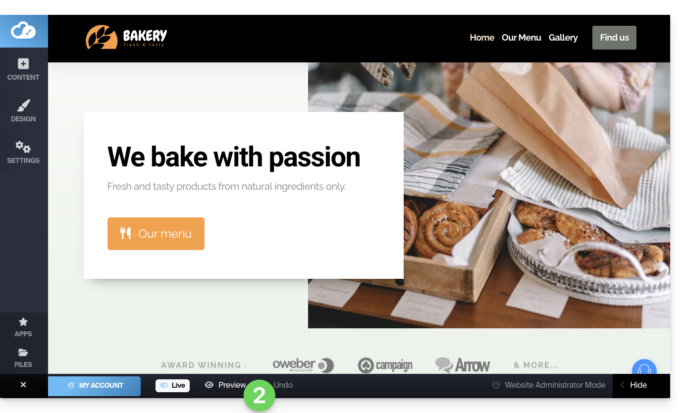
- At the top of the page, click on the action menu ⋮ to the right of Preview to change the type of device for viewing.
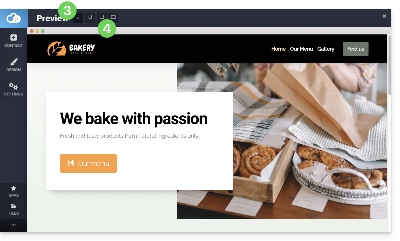
- Click on the different device icons to simulate the different viewing formats (mobile, vertical, horizontal, etc.):
Display your site in a reduced width
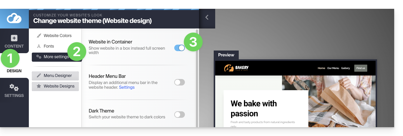
You can reduce the width of your site within a "container" or "box". This special display will only be visible on large screens, such as desktop computers:
- Click on the Design button in the left-hand menu.
- Click on More settings.
- Activate the toggle switch for the Container display:
- Save the changes at the bottom of the page.
Hide a content block based on the device type
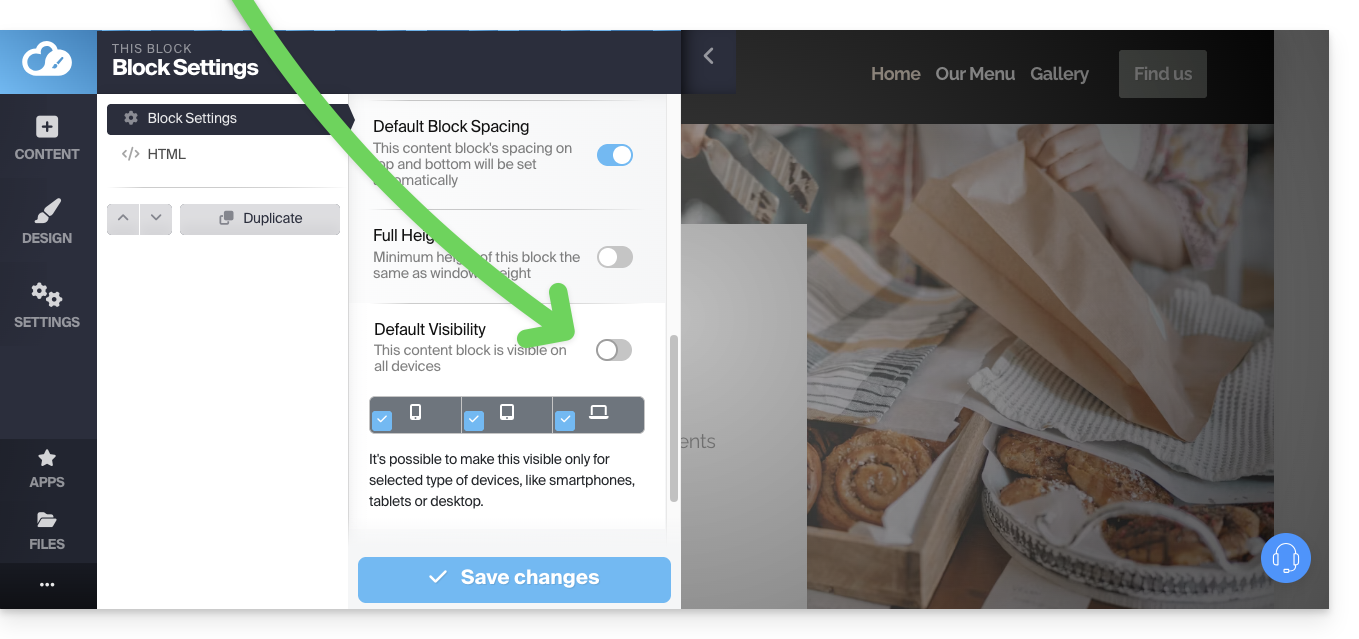
In the options for a content block, by disabling the default visibility, you can then define that it should only be displayed on certain device types (e.g., mobile devices):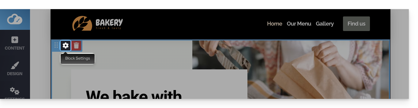
Link to this FAQ: https://faq.infomaniak.com/2707
Has this FAQ been helpful?